Control Menu Bar
Control Menu is a toolbar that provides identification and lets the user navigate and perform actions.
Usage
Control Menu Bar is always fixed to the top of the window when we are on medium/large screens.
This header is used on almost every page in the system. It has 2 differnet modes that are displayed depending on the product area the user is:
- Light mode: active for back-office applications
- Dark mode: active for the site
Modes & Parts
Both modes are pretty similar and therefore they work similiarly but with a slight change in the position of the global menu access depending on the scope the user is.
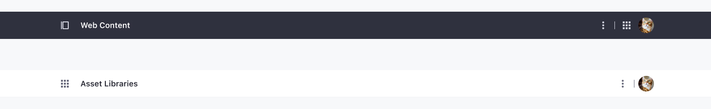
Dark mode
- Left area:
- Product Menu
- Back navigation
- Application title
- Right area:
- Actions: They are identified with an icon when existing, and listed inside an actions menu when an icon is not clear. These actions are application level actions.
- Global Menu
- User Sticker: It allows displaying different navigation options and actions to which the user has access.
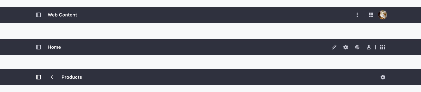
Light mode

- Left area:
- Global Menu
- Back navigation
- Application title
- Right area:
- Actions: They are identified with an icon when existing, and listed inside an actions menu when an icon is not clear. These actions are application level actions.
- User Sticker: It allows displaying different navigation options and actions to which the user has access.