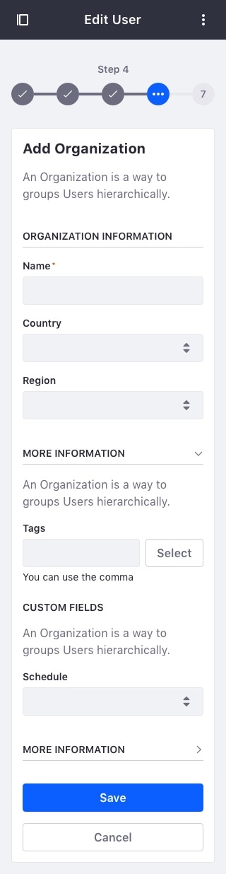
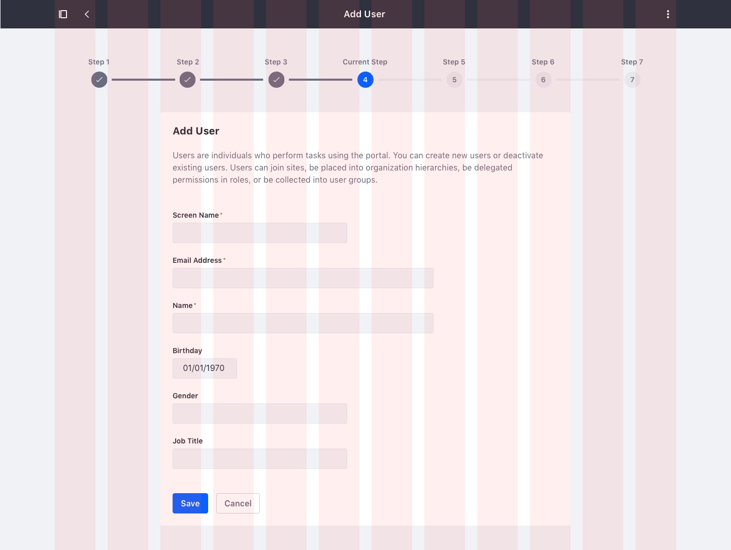
Multi Step Form
A progress bar used to divide the main task into subtasks to help users complete long processes.
Usage
A Multi step form is used when a major or big task has to be divided into smaller task, with the aim of letting the user breath in the process and providing them with a sense of progression.
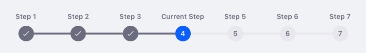
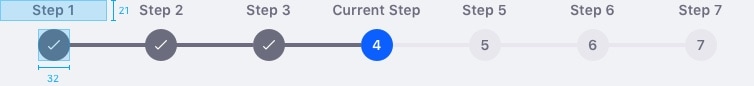
- Each step can have three different states: Disabled, selected, or done.
- Use it to divide long and/or complicated tasks into smaller chunks that are easier for the user to complete.
- Use it to guide a user through a new or unfamiliar process.
- Use it when there is a specific sequence required to complete the form.
- Make chunks that are not overwhelming.
- Step names must be clear, short, and express the content below them. Use two words maximum.
A multi step form must have a minimum of two steps:

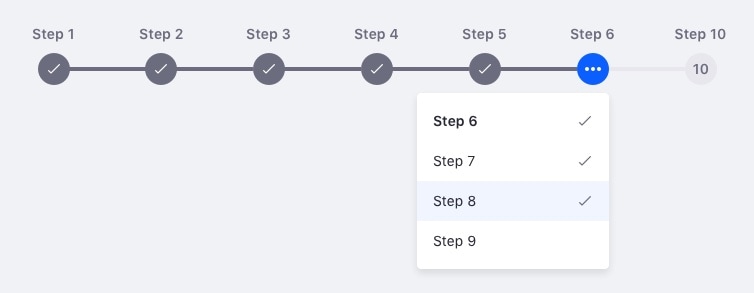
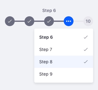
We recommend a maximum of seven steps for two key reasons:
- Seven is an easy number of elements to remember
- Seven is a good threshold for touch interaction on mobile devices
If you add more than seven steps, the remaining steps should be grouped in a dropdown menu under the sixth element in the multi step form:
A Multi step form is most commonly used to guide the user in the process of filling in a complex or long form. Some processes may require you to navigate backwards through the process. For those cases, make sure to set up links in the multi step form elements.
Example
Attributes

- Done: Checked page
- Selected: Current page
- Disabled: Non visited page
- Steps row: equally divided space between all steps
Mobile
Due to the reduced space on mobile displays, the process bar is condensed to a maximum of five steps. The remaining steps are included in a dropdown that is always placed under the second to last step:
Example