Sidebar + Box
A specific layout used when a left sidebar requires a vertical navigation.
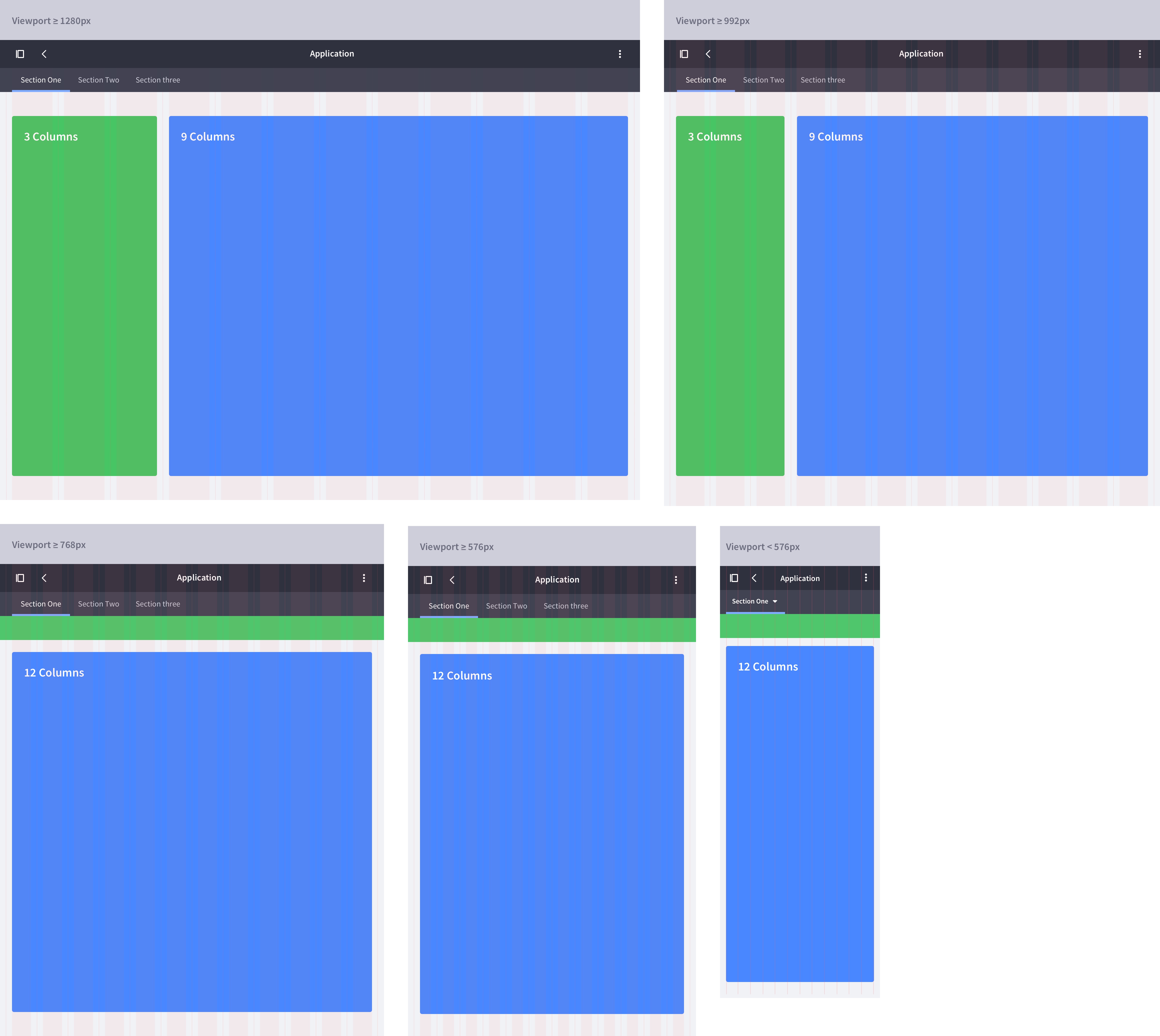
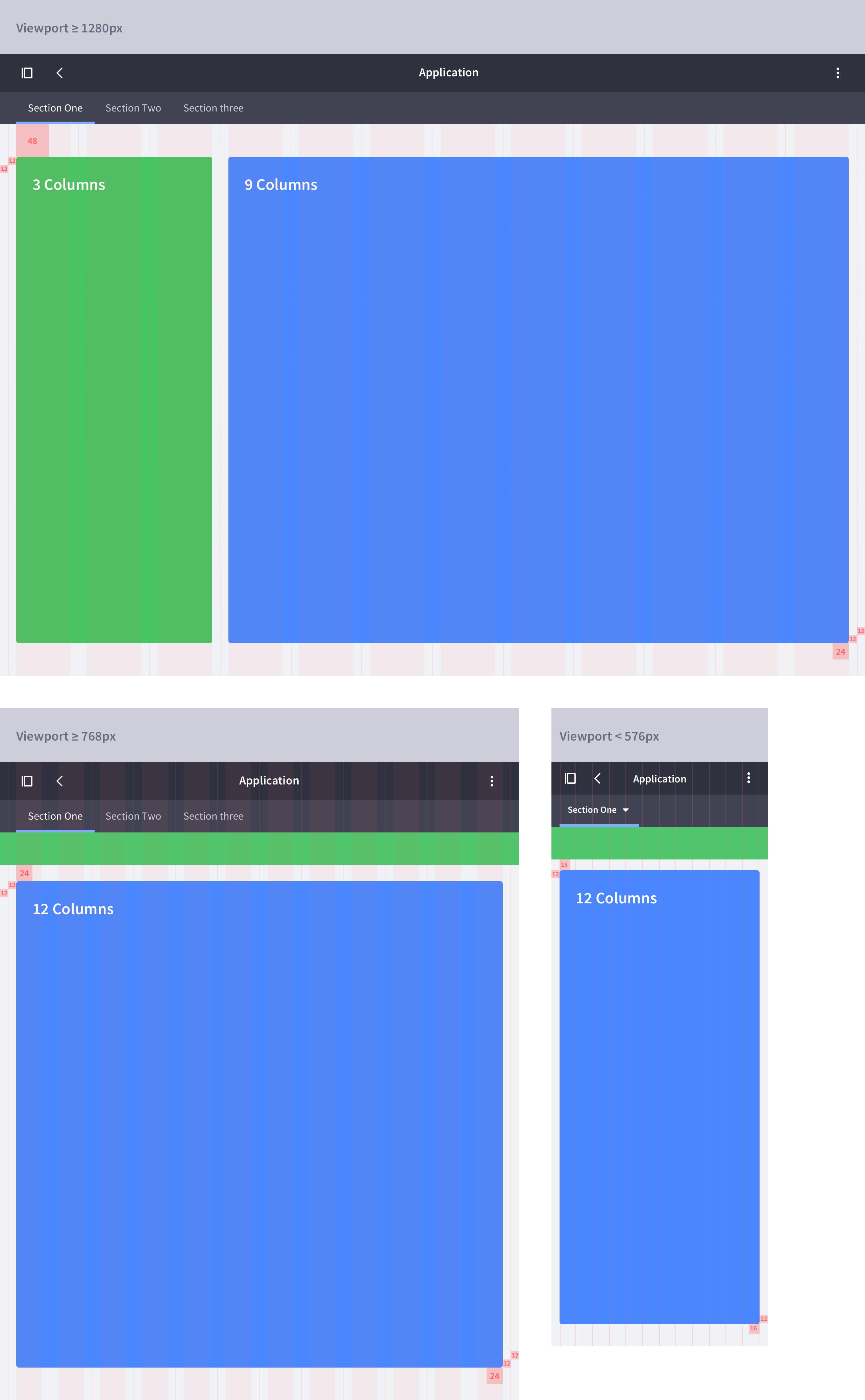
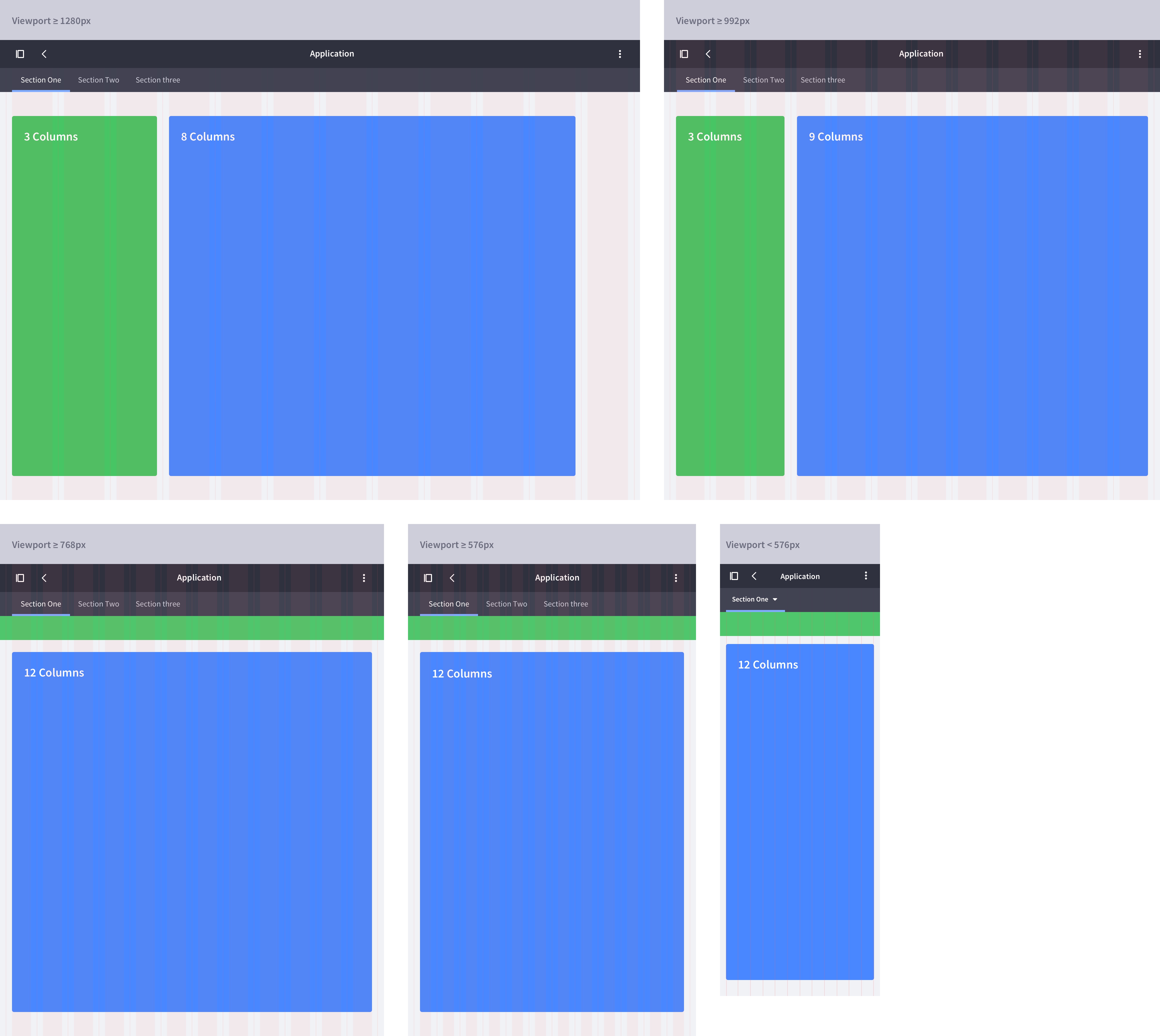
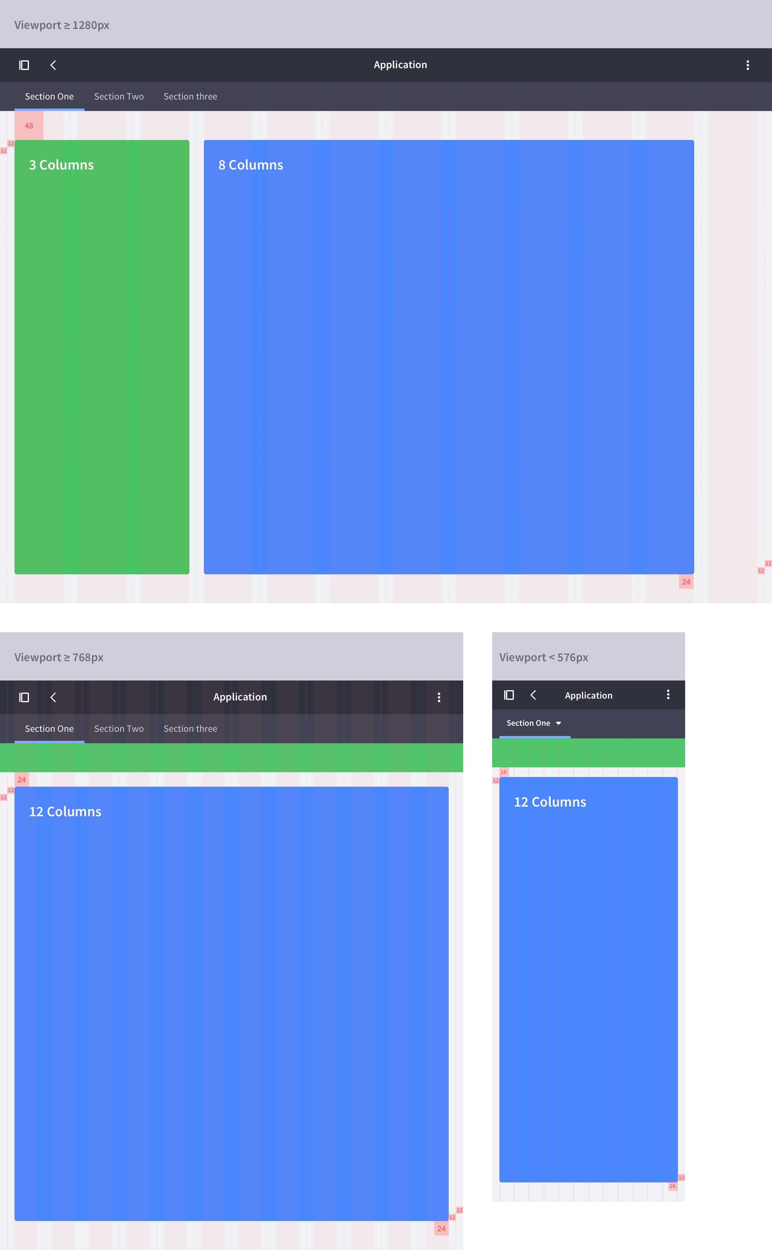
The space is organized in 3 columns for the sidebar and 9 or 8 columns for the content, depending on its type. This results in two different configurations: A 3+9 column layout and a 3+8 column layout. These configurations are covered in more detail below.
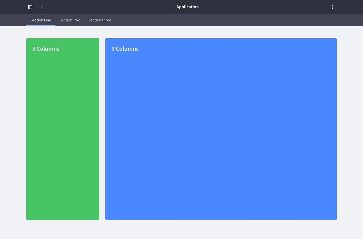
3+9 columns
This is the default configuration for a table, a list, or any other content structure except a form.
Responsive behavior
On viewport sizes equal to or less than 768px, we introduce two key changes to the layout that optimize space for content:
- The the vertical navigation changes to a toggle top navigation, as is described in vertical navigation.
- The box changes from 9 to 12 columns.
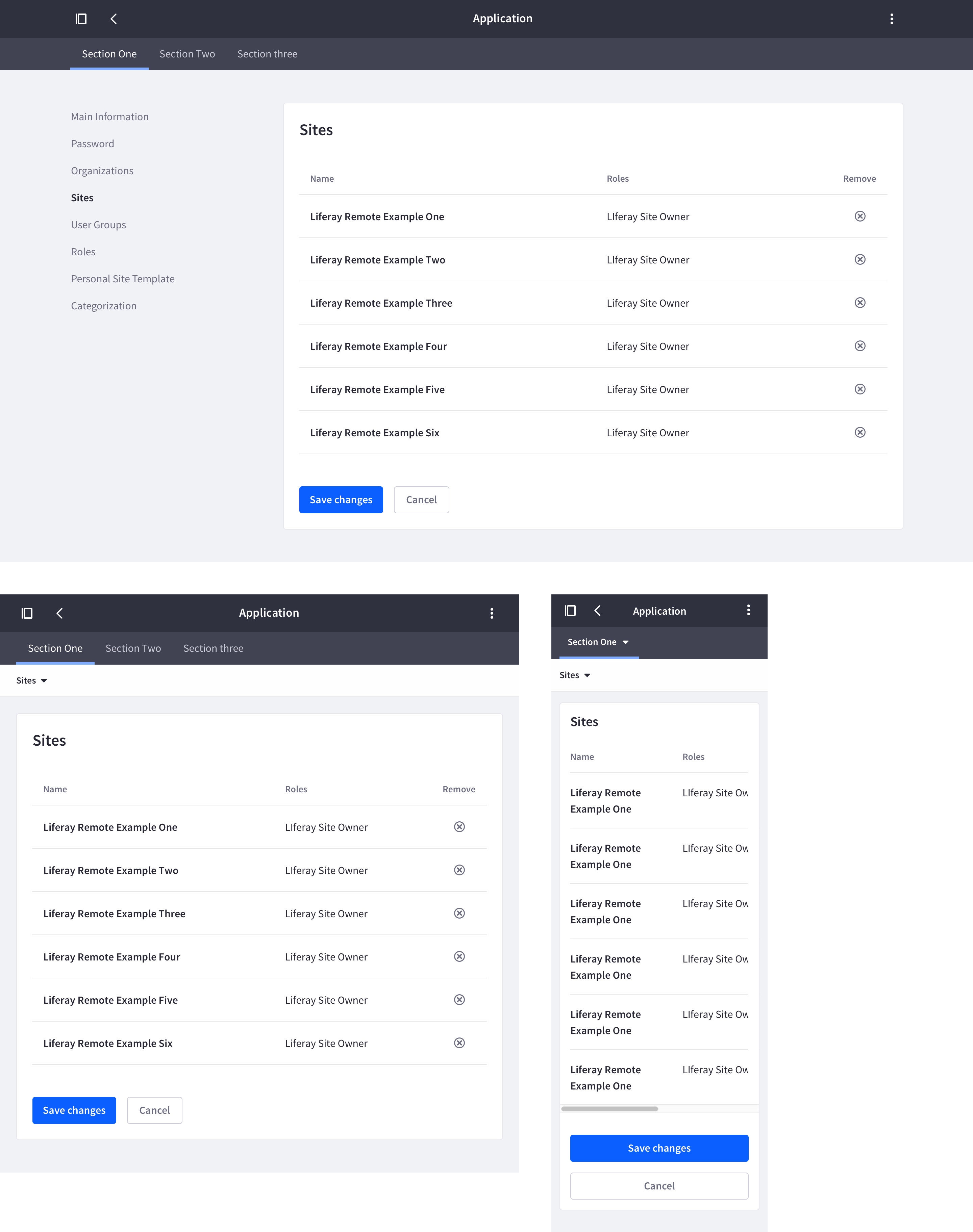
Attributes
Example
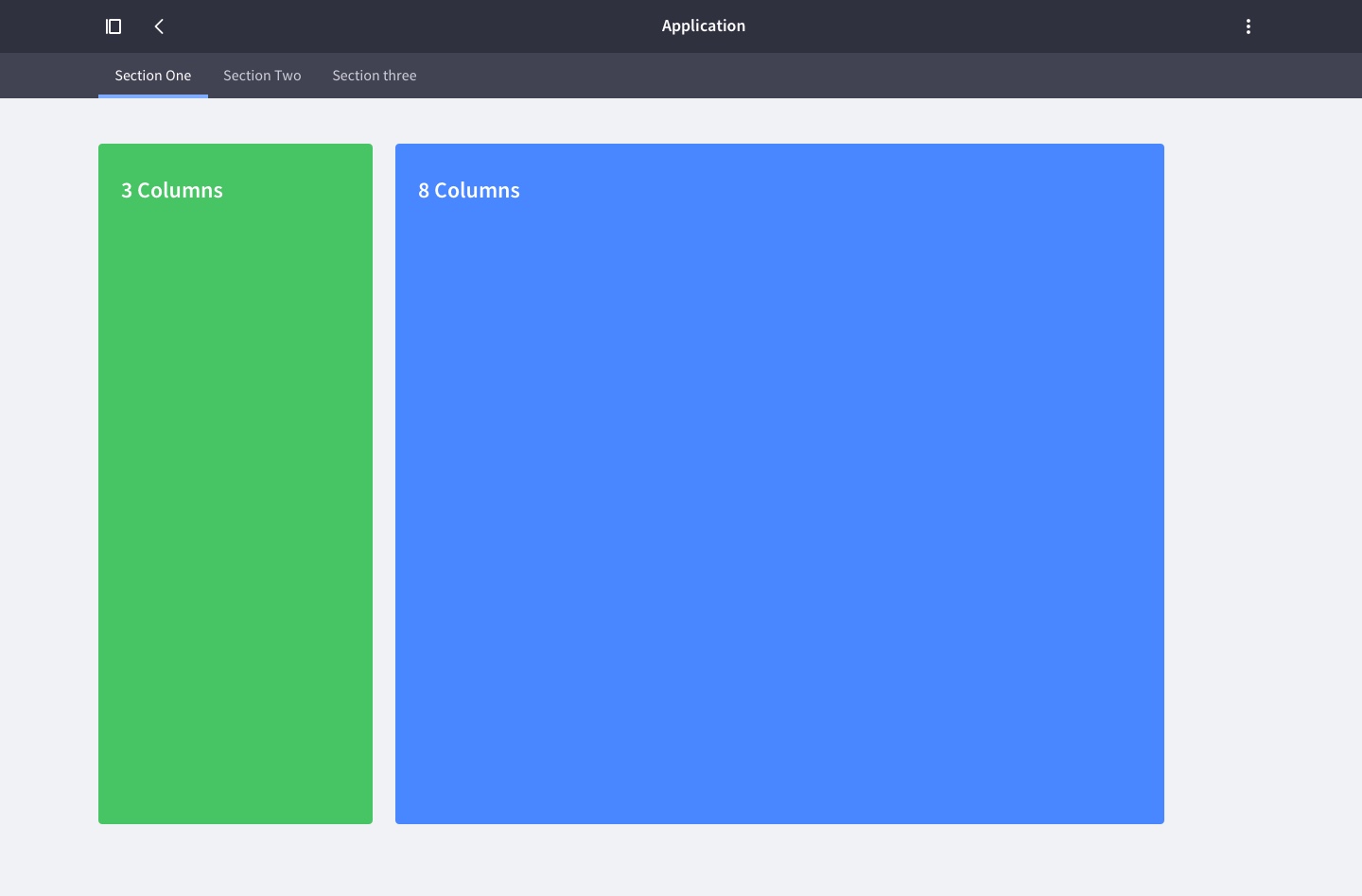
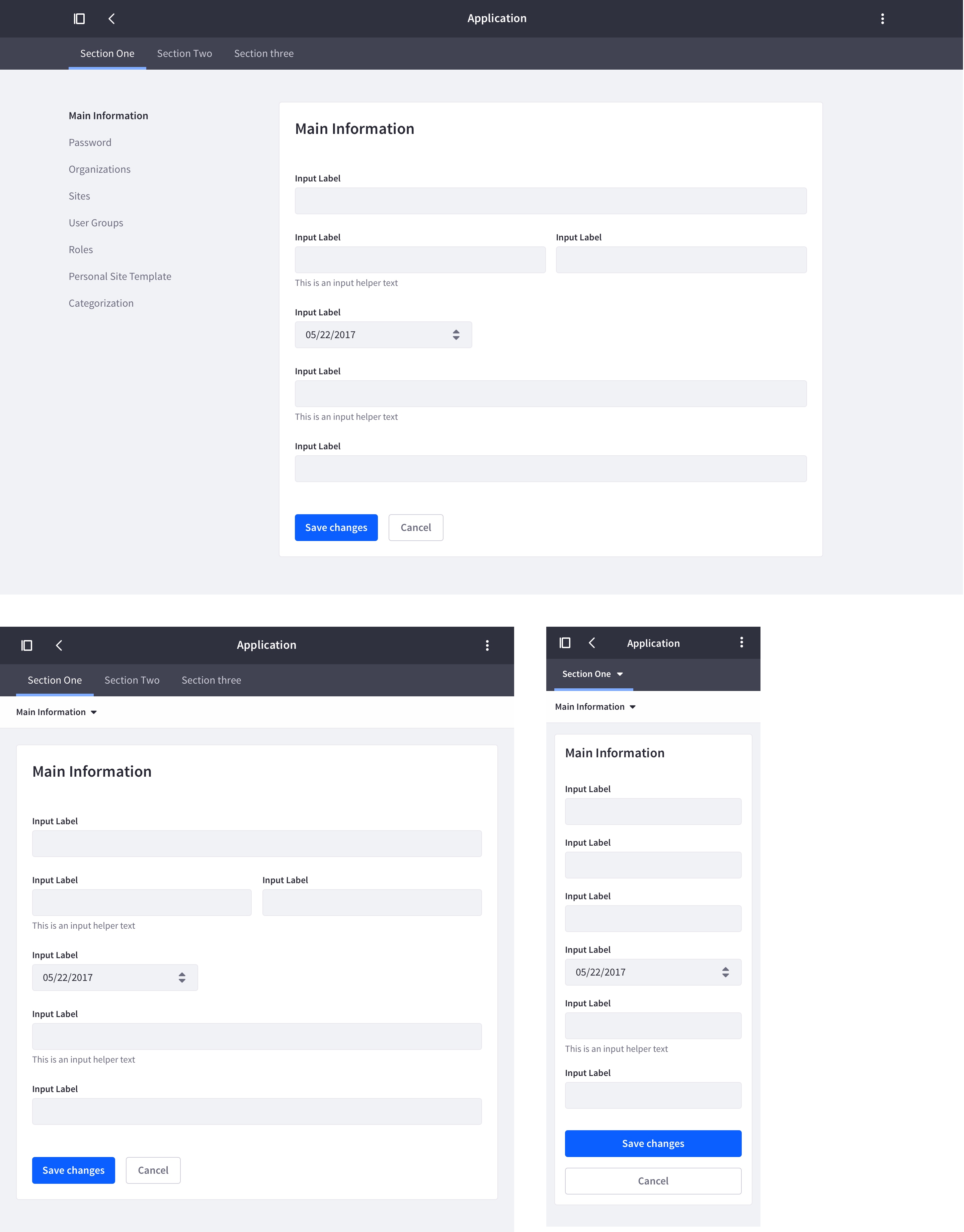
3+8 columns (Forms)
This configuration is used for forms. Form containers require less space than the 9 columns that the default layout provides, so the columns are reduced to 8.
Responsive behavior
Note that, to optimize space for content, the layout changes from 8 to 9 columns on viewport sizes equal to or less than 992px.
Attributes
Example
Exceptions
The 3+9 column and 3+8 column layouts cover most Lexicon interfaces. There may, however, be a few edge cases that these layouts don't cover:
- Scenario 1: A 3+9 columns configuration turns into 2+10 columns configuration.
- Scenario 2: A 3+8 columns configuration turns into 2+9 columns configuration.
These scenarios are only desirable when two columns is enough for the sidebar's width. You may want to consider these configurations, If the points shown below are true for your UI:
- You have really short vertical navigation titles across all languages that your site manages.
- You have more space in the main box to fit a table with many columns.
If you use these configurations, make sure you apply two columns for the sidebar in all application sections for consistency.