Tabs
Tabs organize similar content together into individual sections in the same page.
Usage
-
Use tabs when you need to move between views in the same context.
-
Split your information into groups that are easy to identify by your end users.
-
Order your tabs in a natural way for your users.
-
Use tabs when you don’t need to compare contents.
-
All tabs in a tab bar must follow the same style and type. Having different styles in tabs can produce the feeling of navigation, and this is not the desired outcome for this pattern.
-
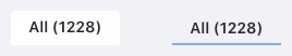
A tab must change to the selected state on user selection. The selected tab must stand out from other tabs. Only one tab can be selected at a time.
-
A tab's label must be short, clear, and concise with a maximum of two words.
-
Do not use all caps in the label. This complicates the readability of the tab.
-
One tab must always be pre selected
-
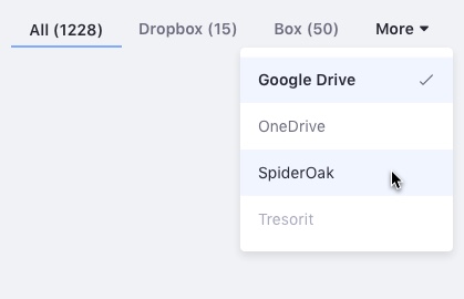
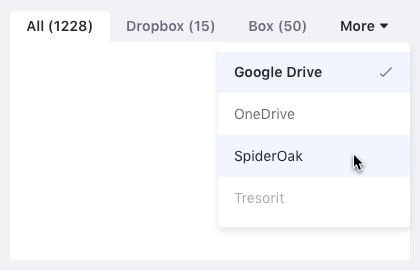
Remaining tabs must collapse below a "More" tab when they don't fit on the screen. This "More" dropdown tab should always be last.
-
Tab bars may need a visual aid to help give context. In this case, you may use a thin line under the tabs bar, as shown in the following example:

Variations
Classic tab
Use the classic tab type inside forms.
Modern tab
Use the modern tab type together with dataset visualizations, such as the list view or card view.