Image Selector
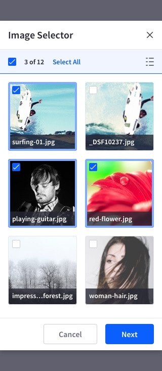
The image selector lets the user select images from a grid, prioritizing over other metadata.
Usage
- Only use this pattern for image selection.
- The elements placed in the grid must be an image type that can support a thumbnail.
- Simple and multiple selection must be possible.
- Selecting a single image closes the image selector modal.
- Multiple selection lets the user select as many images as they need. In this case, the modal is closed with the “Done” button.
- Hovering an image displays its title. Long titles have ellipsis in the middle, while still displaying the end of the title so the user can quickly identify it.
- Image titles are always shown on touch interfaces.
Image status
Default

Hover

Selected

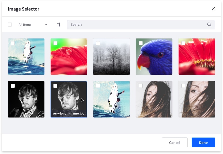
Image selector example on desktop:
On mobile devices, since there is no hover state, images must always display their title.