Section
A component that groups content to be processed more effectively.
Types
Section
When used in its simplest form, not being collapsible, it provides a way to display information in a hierarchical structure.

Section Collapsible
Sections can be expanded or collapsed to reveal or hide content contained within. To show that users perform this action, it displays an icon that changes based on whether the component is open or closed.

Sizes
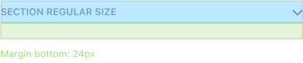
Regular

As mentioned in the Form Sheet section. Sections can be used to establish a content hierarchy on a form. Regular section items stack vertically with 24px margin in between.
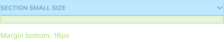
Small

Small section items stack vertically with 16px margin in between.
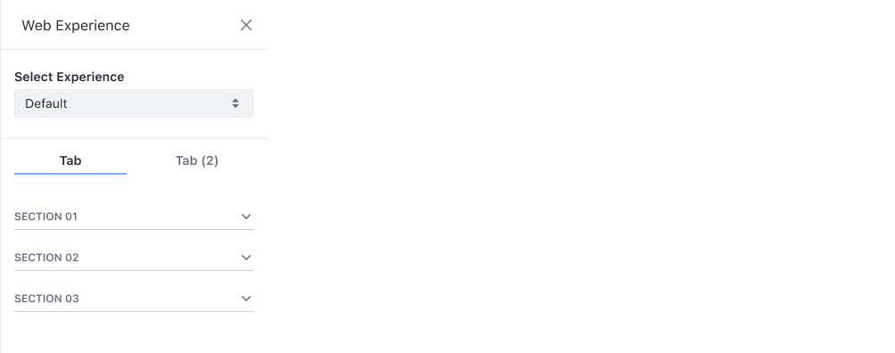
It can be used to establish a content hierarchy on a Sidebar.