Link
Also known as a hyperlink, a link is a clickable (text or image) element used for navigation purposes.
Usage
- Only use links for navigation. A link must not trigger another kind of action.
- Do not use a link to trigger an action that could trigger a button. If you want to trigger a button, use a button link instead.
Types
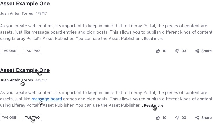
Inline Link
Use an inline link when you need a link to flow naturally with a sentence or paragraph.
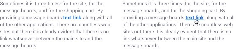
Attributes:
- Color: primary blue
- Font weight: inherit
- Hover: primary blue hover color + underline
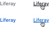
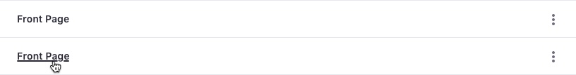
Single Link
A single link is used for stand-alone hyperlinks. They can be text or an image.
Attributes:
- Primary Text Link _ Color: primary blue _ Font weight: semi bold * Hover: primary blue darken 5% color + underline
- Secondary Text Link _ Color: secondary gray _ Font weight: semibold * Hover: primary gray color + underline
- Image * No styling
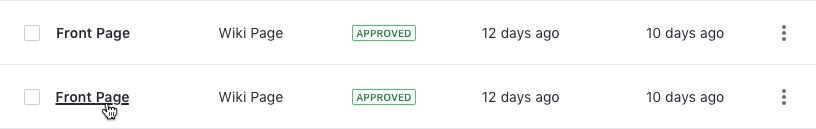
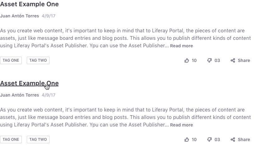
Title Link
A title link is used for list item titles, such as Dataset Display (stacked list, table, or cards), asset title, blog entry teaser title, etc.
Example 1:
Example 2:
Example 3:
Attributes:
- Color: inherit
- Font weight: inherit
- Hover: underline
The image below demonstrates all the available implementations:
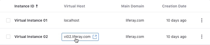
External Link
Use external links to point to (target) external resources that are available on domains other than the current domain (source). Lexicon indicates this behavior with a tooltip.
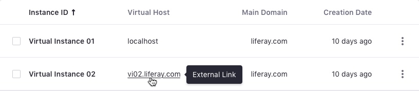
For accessibility purposes, we also provide an icon to illustrate this behavior. This icon is visually hidden by default and only accessible on focus or when using assistive technologies such as screen readers.